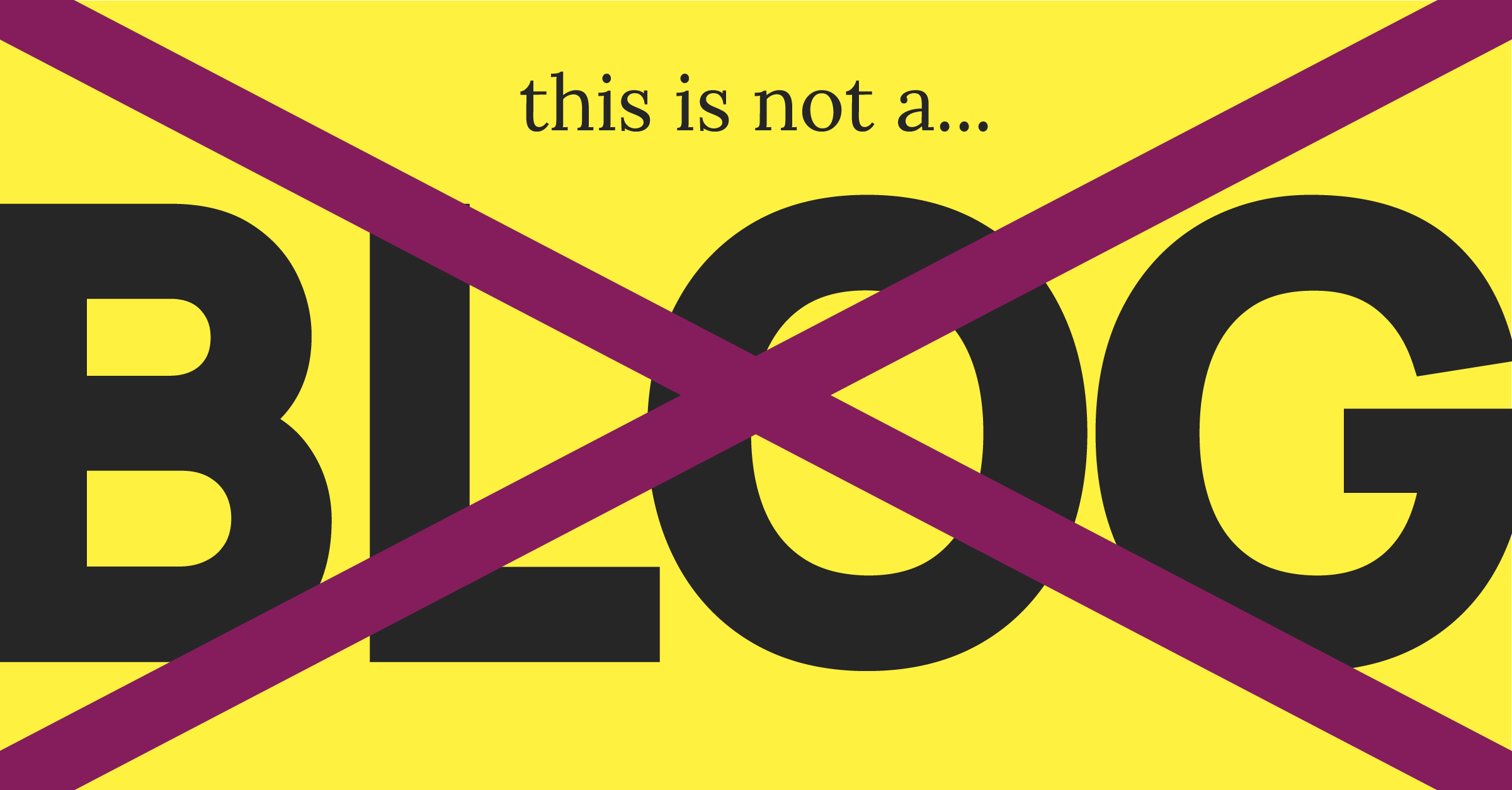
This is not a blog post... It’s a skimmable piece of content tailored to your fragmented attention span.

Attention spans keep getting shorter.
Our digital world is cluttered with infinite scrolls of algorithmically determined sensory slop that is shortening user attention spans and changing the way users ingest digital information.
<1 minute
On average, users spend less than one minute on a web page.1
28% of words
Users typically read only 28% of the words on a page.2
~8.25 seconds
The average digital attention span in humans is about 8.25 seconds.3
When it comes to content,
structure precedes substance.
Walls of text can contain plenty of information, but they’re less likely to be read. Break your content into shorter paragraphs to make it more visually approachable, and ensure that your largest text conveys a clear, standalone message that draws readers in.
At-a-glance readability is the key to in-depth readability.
1.
The most prominent text is most likely to be read at a glance.
Use a clear typographic hierarchy to ensure that headers stand out visually and can be quickly scanned. Your largest text is prime messaging real estate.
2.
Make your point in the header.
Leverage this prime messaging real estate to communicate a message that draws readers in and stands alone—even if it’s the only part someone skims from that section.
3.
Structure your information to make it visually approachable.
Use visuals, bullets, and a clear hierarchy to break up text into digestible key points. When content appears quicker and easier to read, it feels more approachable; if readers can scan without needing an in-depth reading, your message will reach a broader audience and suit different attention spans.
4.
Ditch using headers as labels, or place them in a preheader instead.
A label-style header like “What We Do” forces users to read deeper to understand your message — and most won’t. Instead, use your header to communicate value at a glance. If you must keep a label, tuck it into a pre-header so it supports the content without taking up prime messaging space.
The Dos and Don’ts of Content Structure
How many times has someone said to you, "I didn’t actually read it, but I saw the headline"?
Do
Don't
Did you make it this far?
Here’s a dense paragraph of body text located at the bottom right of the page (or just the bottom if you’re on mobile). If you’re still reading, congratulations to you (and maybe to me). This is the least likely content on the page to be read. You’re either bored or interested enough to take the extra step and dive deep into this wall of text. If it’s the latter, feel free to email me to discuss content structure and designing for today’s fragmented attention spans.
Fine print. Lorem ipsum dolor sit amet, consectetur adipiscing elit. Donec tempus massa id ligula pretium lacinia. Praesent mattis eget lectus ac maximus. Maecenas consequat magna a mi elementum sagittis. Praesent non congue massa, iaculis rutrum turpis. Vestibulum vitae consequat eros. Mauris iaculis volutpat ultrices. Donec suscipit rhoncus nunc, at interdum augue porttitor volutpat. Integer lacinia sapien at erat tincidunt malesuada. Nulla aliquet elit in libero commodo tempor. Sed congue risus non accumsan venenatis. Quisque lobortis orci consequat magna porttitor tristique.
Footnotes
- https://www.forbes.com/advisor/business/software/website-statistics/
- https://theessential.agency/blog/changes-in-reading-behaviour/
- https://www.iacet.org/events/iacet-blog/blog-articles/short-attention-spans-and-long-term-retention-the-evolution-of-learning-in-the-digital-space
